
For years, web design was based on a very clear premise: people mainly browsed the internet from desktop computers. However, that scenario has changed completely, and today most web traffic comes from mobile devices. This has forced a rethink of how websites are designed, giving rise to the mobile-first approach.
What is mobile first?
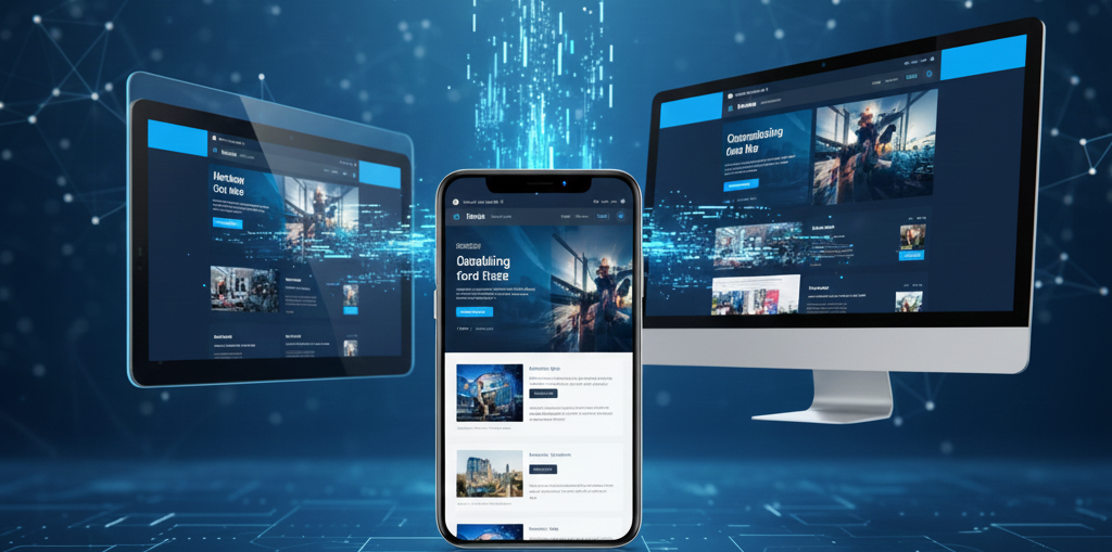
Mobile first is a web design and development approach that proposes creating the version of a site for mobile devices—such as smartphones and tablets—first and then progressively adapting it to larger screens, such as those of laptops. More than a visual trend, it responds to the evolution of user behavior and key changes in search engines, such as Google, which now prioritize mobile indexing to evaluate and rank websites.
The increasing use of mobile devices made it clear that designing only for desktops was no longer enough. For years, the solution was to cut desktop versions to make them work on small screens, but many of those elements did not adapt properly: long texts, complex menus, small buttons, or heavy images ended up affecting the user experience. Faced with this scenario, the mobile-first approach, also known as progressive enhancement, emerged, which proposes building from the essentials and gradually improving the experience according to the capabilities of the device.
Key principles of the mobile-first approach
1. Prioritize content
On mobile devices, there is no room for the unnecessary. Every element on the screen must serve a clear purpose. This requires identifying what information is truly important and what actions should be immediately available to the user.
2. Design from the smallest screen up
The process begins with mobile design and then scales up to tablets and desktops. This ensures a clear, focused foundation that is easy to adapt to different screen sizes.
3. Responsive design
The site should automatically adapt to the size of the screen from which it is accessed. This means that the content, images, and structure of the site are adjusted to look and function well on a cell phone, tablet, or computer. The goal is to provide a consistent, comfortable, and easy-to-use experience on any device.
4. Touch-friendly interface
Mobile devices are not navigated with a mouse, but with your fingers. Therefore, buttons and links should be easy to identify, adequately sized, and well spaced to avoid accidental touches.
Mobile-first design best practices
- Keep it simple: white space is also a design resource. It helps reduce distractions and improve content comprehension.
- Clear visual hierarchy: mobile-first design prioritizes content first. The most important information should be highlighted and appear first.
- Optimize text for scanning: people don't read, they scan. Use short paragraphs, key information at the top, and structures that are easy to scan visually.
- Think like an app: use familiar gestures and avoid effects that don't work on mobile, such as hover.
- Optimize images and graphics: avoid awkward cuts and leave more complex visual elements for the desktop version.
- Design for fingers, not a mouse: interactive elements should have a minimum adequate size (ideally 44px) to avoid tapping errors.
Advantages of a mobile-first approach
Adopting mobile-first not only improves design, it also has direct benefits for the business:
- Better user experience.
- Better SEO performance, aligned with Google's mobile-first indexing.
- Faster loading times.
- Greater accessibility and reach.
- Long-term cost reduction, as the site is designed from the outset to work properly on mobile devices and does not require subsequent redesigns.
- Preparation for continued growth in mobile traffic.
- Clear focus on essential content.
- Easier scalability to large screens.
Is mobile first always the best option?
Not necessarily. In cases involving complex web applications or highly specific tools, a mobile version may not be sufficient. In such scenarios, it may be more appropriate to develop a native app, even if this involves greater technical effort and maintenance.
An approach that changed the way we design the web
The concept of mobile first was proposed in 2009 by Luke Wroblewski, Product Director at Google, who argued that designing for desktop first no longer made sense in a world dominated by mobile devices.
Since then, the mobile-first approach has forced designers to simplify, prioritize, and put content and user experience at the center, resulting in clearer, more accessible sites that are better suited to the real needs of those who use them.